Apple iOS 7 Killed Skeuomorphism!!!!


“So let us remember that on June 10, 2013, skeuomorphism began to die.
That the breaths it took first in the early 1980s
(and which we only named much later) are turning shallow”
––– A Eulogy for Skeuomorphism
If you haven’t heard this fluffy bit of nonsense, you haven’t been listening. It’s the current, pointless arguement going on now, not unlike nonsensical MAC vs PC fights that can never be won. No, iOS 7 didn’t kill skueomorphism, and I can prove it. Skeuomorphism is not dead! How could it be? It was never actually alive! The same could be said of hatching and cross hatching, pointillism and stippling, screw drivers, bottle openers, Prismacolor and Strathmore. Skeuomorphism is a technique, a tool, not a genre. And despite what you may be reading of late, it is also most assuredly not a product of the digital age exclusive to operating systems or mobile interfaces.
The word has been used to describe one material mimicking another or any real world object since the late 19th century. That’s right, not the 1980’s, but the 1890’s! For those of a certain age, skeuomorphism also gave the bloated station wagons of the 60’s a nod to the trendy woodies of the 40’s and 50’s to create familiarity and acceptance and most especially trust as a vehicle for the whole family. And that tactic worked just as well with operating systems.
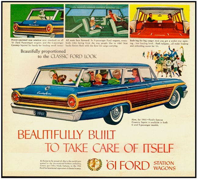
In the digital realm, it was used remarkably effectively by online designers to give users a nostalgic reference point to make the technology more familiar and less coldly digital. And it worked wonderfully well. Users delighted in the appearance of “rich Corinthian leather” bound notebooks and “knotty pine bookcases,” and they were more comfortable in learning how to handle the new idioms of the technology. But like the Ford station wagons of the 1960’s with their skeuomorphic (un)wooden trim over actual gleaming chrome, consumers were tiring of the past and longing for something new.
So now flat design is in. Gone are the sinuous curves and fins of last decade’s models. Now we are greeted by the clean lines of the new. It’s an age-old story of change. The change has been welcomed by many, and has shocked (SHOCKED) more than a few. And strangely, skeuomorphism itself has become the pivot point of conversations. It’s good. It’s bad. It’s lovely. It’s hideous. It’s needed. It’s obsolete. And when all is said and done, poor skeuomorphism can’t really be any of those things. It’s only a tool.
Now design on the other hand can be any of those things. Bad design is bad regardless of how it mimics reality. Leo Burnett famously said, “There is no such thing as ‘soft sell’ and ‘hard sell.’ There is only ‘smart sell’ and ‘stupid sell.’” The same is true of design. It either looks smart, or it looks stupid. Online design especially has to accomplish a lot of things at once. Of course, it must first capture the imagination of the user. It must also be utilitarian and provide guidance and purpose. And it must differentiate itself from its surroundings. Oh, … and it has to do all those things at once. Skeuomorphism doesn’t even enter into it.
On our new PADV site, you have to see our range of capabilities and our design and marketing sense, and how we differentiate ourselves from the competition. And you have to see it immediately and memorably. Simultaneously. Is it or isn’t it skeuomorphic? Who cares? The tools we use in our design are dependent on the needs of our clients and the audiences they need to attract. Any tool we need to make that happen, is exactly what we’ll use.
That’s only smart.
