Are Fonts Emotional?


Well, they don’t actually cry at sad movies, however, when designers choose fonts for your logo, they look for a style that makes a statement about you and your company and creates an emotional connection with your audience. That seems like an awful lot to demand of 26 innocent letters and the odd punctuation marks, but there is a mix of practicality and psychology behind those decisions.
Practically speaking, your first questions have to be: what job do you want your font to do? Make you look professional? Make you navigation elements easier to read. Reveal your artistic bent? Express a lighthearted feel? Once you establish your goals, your design choice become easier.
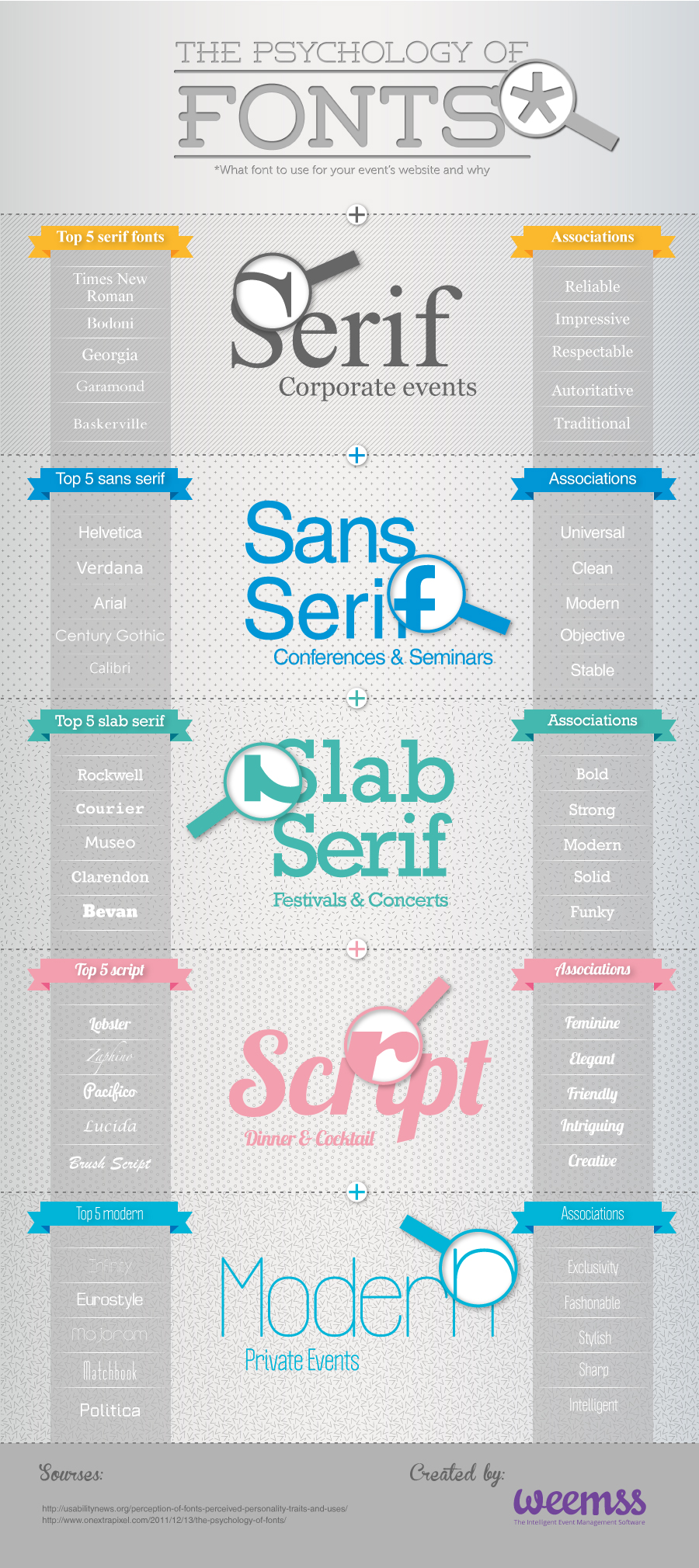
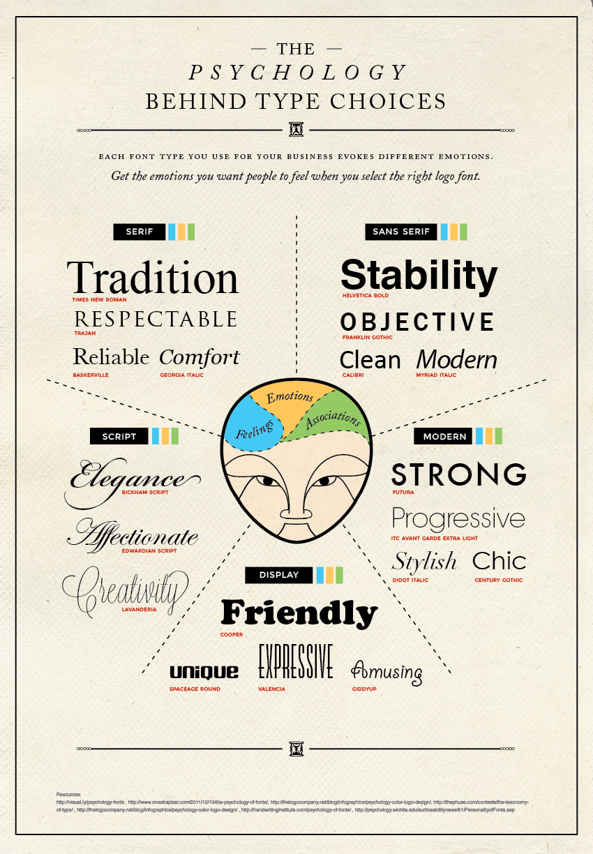
For instance, online, you know you are going to have to choose between basic font styles: serif, sans serif, script, modern, and/or display typefaces. A script face might help you express your company’s personality, but if you use it in your navigation, legibility problems might annoy your audience and send them to the next site that comes up on Google. Psychology schmychology, if you lose your audience, what’s the point?
That said, there are certain considerations you have to take into account when you choose the right font for your logo. Virtually everyone knows that colors evoke certain feelings, emotions, and associations. Similarly people respond emotionally to typefaces and fonts.
Here are a couple of infographics from designers with their input on font face psychology.