Make Your Website Mobile Friendly NOW! Or Not…


Did you feel it? Last week, according to tech reports worldwide, the ground trembled before the mighty strides of Google to make mobile searches more mobile friendly. From now on, when people on mobile devices search for a web site, mobile-friendly sites (translation: ones they can actually see) will appear first. Astonishing. Amazing. Unheard of! And wildly overdue.
As mobile devices have taken over the majority of web searches from their desk-bound kin, all-too-many websites have lagged behind. Even those sites that claim to be “mobile- ready,” are virtually illegible on some screens, especially on smart phones.

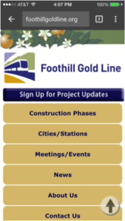

The “mobile friendly” sites above represent three of the most popular smart phone styles, 1. Mobile in name only (if you could see the black bar at the bottom of the first screen, it reads “Mobile desktop” but it’s too small – Google will notice), 2. Smartphone specific* (a separate mobile site design that still updates whenever new copy or images are inserted into the main site’s CMS), 3. Responsive design* (that immediately adjusts to the size of the mobile or desktop screen, and can be dragged to those sizes whenever desired).
Mobile-overkill
But… does this mean that every site has to be mobile friendly as of last week, or the world will come to an end? Not really. Of course, if you’re talking about shopping sites, event sites or transportations sites, then yes. Absolutely.
Over half the people out in the world, on the go, are texting, checking traffic, looking up schedules and shopping, even in brick-and-mortar stores, on their phones. They’re looking for fun, comparing prices, finding bargains, and making purchases. They can’t purchase from you, or find your event, if they can’t see you.
However, there are sites out there that are not currently getting significant numbers of mobile visitors because of the nature of their organization and/or their audience. It’s an ever-decreasing number to be sure, but they’re out there. Your site might be one of them, and since it costs money to mobilize a static site, how can you be sure if you need to change it? Simple. Look at your stats.
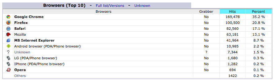
Above is an overview of traffic broken down by AWStats (a brief traffic overview available on most CPanels) that can give you an excellent indication of who is visiting you on what – including cellphones. When you see your top browsers are Google Chrome, Firefox, Safari, Mozilla and Internet Explorer, you can’t be certain how many of them are mobile browsers. But look closer. The Android, LG (PDA) and iPhone browsers are definitely mobile searches and visits. Of that you can be certain. On the site above, mobile visits comprise less than 5% of the visits. This is a site that can wait to be mobile enabled.
Should it be done? Yes, as soon as budgets permit or traffic begins to change, it has to be done. Begin to budget for it now, to be sure. But for sites like the one above, it doesn’t have to be done today, and probably not tomorrow. Still, now is the time to look carefully at your current site, and decide what you want mobile visitors to have access to on their small screens, so that when you decide it’s time to mobilize, you can give your designers some direction.
Google’s decision to make mobile searches more relevant is a good one. Smartphone penetration in the market is significant and growing exponentially. Sooner or later, all sites will be mobile enabled, because everyone will want to be seen and heard by everybody no matter where they are. Bottom line, if you need to create a website today, you need to make it mobile accessible. It will cost more later to change it from desktop-only to mobile, and when the time comes, it’s a price you’ll have to pay.
But when the time comes to mobilize your site, you, and everyone looking for you, will be glad you did.
Tony Nino
VP Creative
PADV Pasadena Advertising
*designed and produced by PADV
