PANTONE Fashion Color Report Spring 2014


PANTONE Fashion Color Report Spring 2014
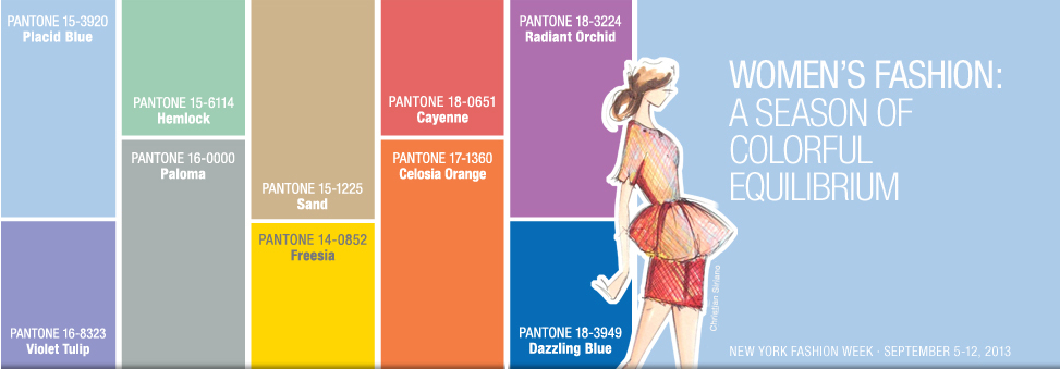
Designers take a modern twist on the traditional for spring 2014 by pairing soft pastels with vivid brights to create a colorful equilibrium. Inspired by a mixture of blooming flowers, travels abroad and strong, confident women, designers use color to refresh, revive and defy conventional wisdom.
“This season, consumers are looking for a state of thoughtful, emotional and artistic equilibrium,” said Leatrice Eiseman, executive director of the Pantone Color Institute®. “While this need for stability is reflected in the composition of the palette, the inherent versatility of the individual colors allows for experimentation with new looks and color combinations.”
Three very adaptable pastels sit on one end of the palette, and, because we are so accustomed to seeing them as nature’s background, they can be creatively combined with any other color in the spectrum. Placid Blue, like a picture-perfect, tranquil and reassuring sky, induces a sense of peaceful calmness, while Violet Tulip, a romantic, vintage purple, evokes wistful nostalgia. Similar to the verdant shade of springtime foliage, Hemlock, a summery, ornamental green, provides a decorative touch that’s very different from the greens of recent seasons. Pair any of these versatile pastels with a bolder hue for an au courant look.
Read the whole blog here.
