Mobile Keeps Downtown Santa Barbara Rolling 24/7
Santa Barbara is known far and wide for it’s seaside air and cosmopolitan charm. But in today’s international marketplace, there are a lot of destination choices, especially in Southern California. DowntownSB.org asked PADV to make sure their community’s distinctive image was “always-on” so that visitors could see it in it’s best light. The brand needed to shine 24/7, everywhere people might look, especially when travel decisions were being made: on an office desktop or laptop, or out and about on a tablet or smart phone. They had to be at their best, no matter what device their audience was on. Santa Barbara had to stand out.
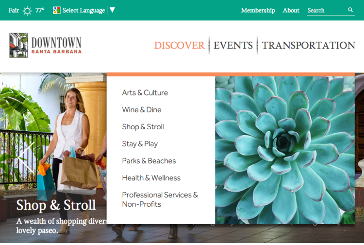
DESKTOP:
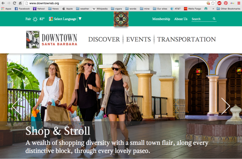
For the desktop, designer David Ensz took full advantage of all the color and depth of today’s big-screen flat panel displays. He used this canvas to project the broad expanse of Santa Barbara’s ambience with a tapestry of color, type and space that tempted visitors with the promise of the unforgettable experiences they could expect in downtown Santa Barbara.
Bold, stylish, dropdown navigation windows were created to reflect and reinforce the allure of downtown Santa Barbara. Images of local architectural details and coastal succulents accented the easy-to-find and easy-to-read menus that took visitors to whatever Santa Barbara experience they might be looking for.
LAPTOP/TABLET/LAPTAB:
As laptop and tablet screens have grown and shrunk, the borders between all of those displays are not getting enough attention. At one time or another, DowntownSB.org has many audiences glued to displays of all sizes. Many larger tablets and smaller laptops (above) share similar aspect ratios which can be adjusted for with relatively minor font size and image relationship adjustments. Beyond that takes more than simple responsive site design.
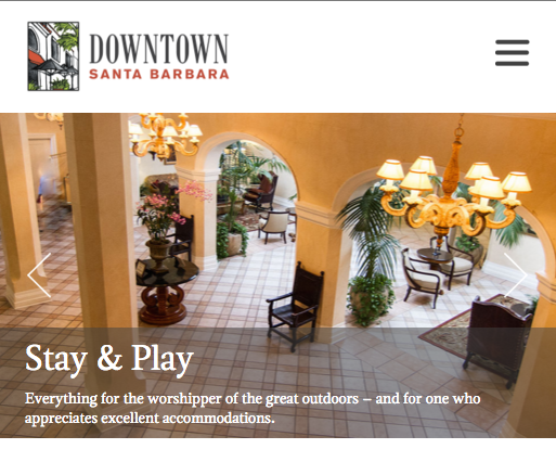
To consistently and effectively project any brand’s image, every page of every site not only has to grow and shrink to fit the multitude of available screens, but also, in Santa Barbara’s case in particular, eliminate oversized elements that lose effectiveness at smaller screen sizes, such as the ornate navigation bar, in favor of the popular, compact pancake-menu navigation (upper right). Just that one change maintained navigation integrity and yet left room for the essential Santa Barbara image that reinforces their brand integrity.
MINI-TAB / MAXI-PHONE
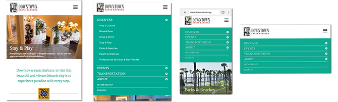
At the far end of the screen size scale are the displays found on the pint-sized mini-tablets and of course ever-growing smart phone screens. This is where even the most beautiful graphic elements of the site are sacrificed to the needs of the audience, the visitor, the customer. There may be less juicy imagery at this level, but this is where business is done. Visitors turn to their mini-tablet and phone when they need a restaurant, a cab, shops, beaches, parks, entertainment, special events, Santa Barbara wines – whatever. And whatever it is, they want it now. That’s what everybody wants…right in the palms of their hands.
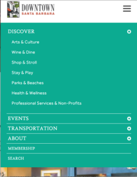
No matter the device, every screen size reinforces the unique Santa Barbara brand, especially at the smart phone level, where the customer truly comes first. The downtown district chose improve their visitor’s Santa Barbara experience with the the smart functionality, reliability and easy to use interface. What better way to reinforce a Santa Barbara’s brand promise of small town comfort and cosmopolitan convenience than by offering it immediately, online.
From the display to the functionality, every device reinforces the same core downtown-by-the-sea image of Santa Barbara. An intimate yet cosmopolitan environment where people of all ages can find something special just for them.


